Tuesday, April 29, 2008

Assignment 1 Re-re-re Edit

Hmmm. As you all know, my computer got reformatted. So I basically had to redo my Assignment 1, so the much earlier post on my first assignment can be said to be obsolete already because i had to re-do the 'I Love Pacman' and I got rid of the 'I Love Pills' thing cuz i felt it was too simple?

Ok, first up, is "i like pacman"


Basically this is a recreation of my earlier work. Even the placement of the big dots and the monsters are the same. I used shapes to frame out my name, and the brush tool for the dots as well as the monsters. I also used grids to help make sure that it was all straight??

Yup.. Thats about all i can talk about my re-creation.

Anyway, as for the second piece, I decided to go with the 'I like Mario' theme.


I can honestly say that i like this one better? Maybe because i spent more time on it. Anyways, for this piece, i used the grid tool again to make sure that everything's aligned and the distance between each letter is same if not almost similar.

I basically traced out using a brush tool the things from the world of mario like the question mark box, the plant in the pipe, mario, the mushroom, the tortoise and etc. Then i colored it all separately using the pencil tool instead. The reason why i used the pencil tool is to give it some sort of pixelated look?? Which is basically what i remember from Mario when i played it on some super old game console, where the graphics were like 8-bit or 16-bit graphics with pixels at the corners and non-smooth drawings.

Yup, and I think my name is spelt pretty clearly in the photo above.

Presentation Assignment

For this assignment, i teamed up with Guan You. Basically we were supposed to find two posters (one good, one bad) and comment on them based on what we learnt so far about design principles.'

First, the good poster:


This poster was taken from the movie 'Shutter'. As you can see in the poster, there is an excellent focus to the centre where the focus of the poster is the face of a ghostly figure. You can tell that there is closure even though they didnt really draw out a ghostly face, because they used a collage of photographs to attain the ghostly face. Also, the ghost is slightly emphasized from the right which gives the impression that the ghost is turning to face the viewer, adding a somewhat 3-D effect to it.

Also, the photo also conveys a very scary and ominous feel to it through the usage of sepia and black and white colors. The gloomy pictures that make up the ghostly face also add to the light wispy texture that one usually associates with ghosts or other spiritual things. Furthermore, the choice of colors through the usage sepia tones and light intensity gives a worn out look and is linked to the theme of the movie, 'spirit photography' as they try to create a color similar to photo negatives.

In addition, the layout of the poster is also quite good as the poster draws your attention to the ghostly face first. After that it slowly leads to the title of the movie below before ending off with a mysterious caption.

Ok. Next up is the bad poster :


First, as you can see from the poster, the background is too detailed, making it fight for attention with the main character in the center of the poster. The bad exposure in the background also causes it to be a jarring distraction from the main character in the poster. The poster also gives the wrong feel that it seems more likely to be a poster to save the rainforest or something, instead of being a poster for a horror movie. This is due to its natural colors and style.

The font used for the movie title also seems out of place and not harmonious with both the girl and the background. Furthermore, the girl who is supposed to be the killer does not convey any sense of agression or sign of being a murderer. This is even after symbols from other horror movies like the hockey mask from the Friday the 13th series and the claws from the Nightmare on Elm Street series are used.

A card for a loved one

Next assignment, was that we had to make a card which theme was 'love'. The card could be done for any loved one, a general good friend, relative, father/mother, or significant other. The card i did was basically for lovers.


Above is the front part of the card. I basically chose the heart shape created by two swans to symbolize "love". I drew the front page by using the pen tool in photoshop and filling the shape with the appropriate color. The background color chose was a somewhat dark red that symbolises love or passion. The red chose wasnt too bright so as not to be painful to the eye.


Then came the back part of the card. Since our card was supposed to be done by a "Cupid Private Limited", i wrote out the company name in the middle, in between the logo of a "cupid angel" and a barcode. All the things at the back of the card was put in a line to show a bit of balance? The cupid was taken from some stock photography website.

Poster Assignment

For our next assignment, we were required to do a poster of either "Save, Kill or Prevent"... Something like "Save the Earth" and whatnot. And we were not supposed to use any photos at all. So for me, basically it was all photoshop photoshop photoshop.


Ok. What i produced was actually my second idea because i couldnt think of a way on how to produce my first idea? What my poster basically screams is "Save HIV" which people in their right mind would go "whurrrrrrt" when they see the poster. This is my way of grabbing the viewer's attention to the poster. They must be thinking like what the hell and why someone is actually asking them to Save HIV when HIV is one of the leading killers in the world today.

So as you can see from the poster, quite a bit of balancing has been done. First, the balance between the big red ribbon on the left and the big chunk of text on the right. Then the balance between the title and the small fine print at the bottom with the website.

Pretty simple poster, because the focus of the poster is more towards the text, so not much emphasis was placed with drawing something more elaborate than the red ribbon. So this is quite a simple poster if you ask me. Simple and straight to the point.

Anyways, about my first idea, i actually wanted to do something with the words "Prevent HIV" at the top with "Protect Yourself" in smaller font below it. This would take the top part of the poster. The other 80% of the poster would be kinda like this happy girl(teenager) in the middle. And she's covered or protected by this large condom. And this might sound a bit gross, but here goes. The girl in the condom is actually surrounded by swimming "sperms". Yup. Drawing them would be something like drawing tadpoles. Kind of controversial, but the controversy would attract more attention rather than drawing people to read text in my opinion.

Photo Assignment

For the third assignment, we had to tell a story in 10photos, without using any words at all.

So, the photos are below in the correct order:


Ok, for those of you who do not get the story, the story goes as follows.
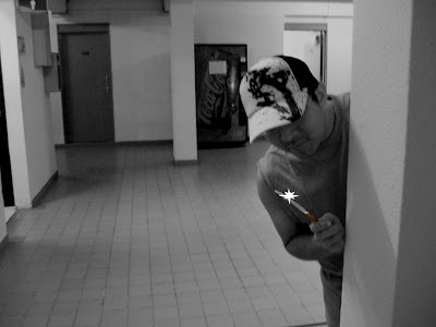
Storyboard
In the first photo, we see someone carrying a knife acting suspiciously and hiding behind a pillar.

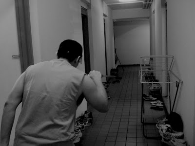
In the second photo, the person is seen walking along a corridor. Questions like where is he going and what is he going to do with the knife should pop up in the viewers mind.

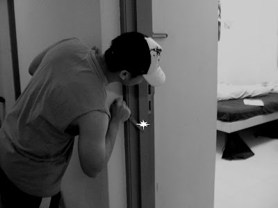
In the third photo, he's peering into a room. This will prompt to viewer to think of what could be inside the room.

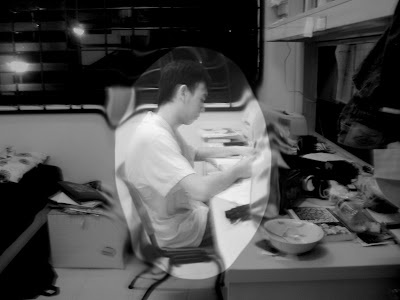
In the fourth photo, we see another character or victim, who is busy about his own business, not knowing that he is being stalked.

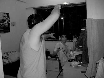
In the fifth, we see the killer charging into the room with the knife held high with a shout. The victim, is shocked to see the assailant.

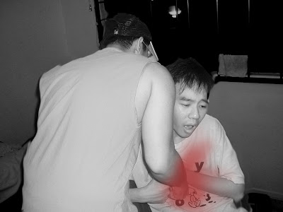
Sixth, victim is stabbed in the body with the knife. Facial expression shows a lot of pain as the blood (red) flows out.

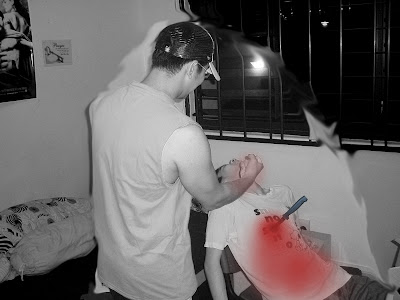
Seven, the killer is seen to be expressing victory/joy. Knife is left in the victim's body, blood still flowing out.

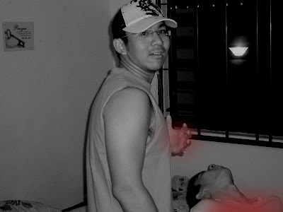
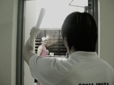
Eight, killer turns and looks at the viewer and thinks "oh shit", there was a witness to the killing.

Nine, zoom out to a person holding a rolled up paper. Is the viewer going to run to get help? Or is he just going to shout at the killer and scare him off.

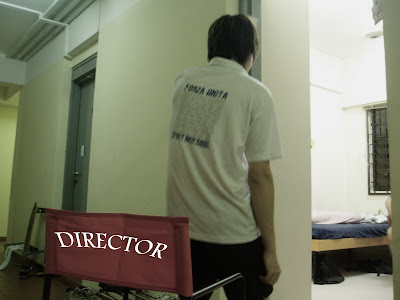
Ten, zoom out further. Turns out the viewer is just a director as seen by his chair and the label "director" on his chair.


As it turns out, its quite a simple and easy to follow story. Camera basically follows the killer who kills someone. Then the killer turns and catches the "cameraman" as if he was a witness. Then the twist is that its actually a set for a movie/tvshow.

With this assignment i was actually inspired by the movie sweeney todd? Unfortunately, i couldnt find any of the old school razor, so I had no choice but to use a knife, which was quite small. Since it was inspired by the movie, i kind of wanted to give it a dark feel, thus using photoshop to grayscale the whole photo and reducing the overall brightness of all the pictures. I only used color to show blood. Also, in the last two photos, the color is gradually introduced back as I wanted to show the transition from "acting" to "real world".

In photo eight, the twist in the story started from here. The killer turned and staring at the camera was basically made to look like he saw a witness (ie. Us). However, I wanted to show was that the director had shouted "Cut!" or something similar which caused him to turn. I hope the idea was put through properly.

Thursday, April 24, 2008

Abstraction with cows

For the second assignment, we kinda had to draw something, and strip it down to its bare skeletal features which define it as what it is. Basically its just abstraction and it sounds kind of complicated. an example of abstraction could be a drawing of a scientific calculator, then a normal calculator, then maybe a rectangular shape with only a screen and a button with the plus symbol on it.

So, for this assignment I wasnt very confident with my work, due to the fact that i cant really draw. Nevertheless, i managed to draw out my assignment of abstraction in my sketchbook and got it scanned.


As you can tell from the image above, the subject of my abstraction is the cow. This is actually my second draft? The first draft had many comments, however i kinda lost the file already due to the fact that my computer had some problems a few weeks ago. Anyway, the difference between the first and second draft was that in the first, i focused more on keeping the cow's horns as the identifiying factor. As for the second draft, i kept the the cow's udders instead.

This is mainly because most people told me that in the first draft, that they sometimes thought of it as a bull instead of a cow if not for BOTH the horns and the spots on the cow's hide. So i decided to keep the cow's udders instead of the horns. Also, for the abstraction process, i removed the spots on its hide in two steps rather than take it out straightaway in one step. Also, subtle things like the cowbell was taken out with other small details on the cow like facial features, and details on the cow's hoof.

In the end, i replaced the cow's body with that of basic geometrical shapes and removed the udders. At this point it was impossible to tell that it was a cow as it could represent any 4 legged animal.

Thus, the logo for abstraction that i chose for this assignment is the 4th drawing.


I selected this as the logo to represent the cow because the shape of the udders still tells me that its a cow, even after i removed the other details. Keeping some other part like the horns, would be ambiguous as some might see it as a bull or the spots, where some people might see it to be some other four-legged animal.

As a personal reflection after this assignment, lets just say i will never look at cows the same way again. haha.

Saturday, March 1, 2008

Assignment1

yes. a very very boring and lacklustre title name for the first post of this blog. and yes unfortunately its only the first post after so blardy long. cuz i admit after creating this blog for my nm2208 module i kind of forgot to post anything into it. =x

ok. first thing's first. my name is eric, and this blog is mainly for nm2208 purposes. for those of you who do not know, thats the drawing/graphics module that im taking this sem. so, other than posting up my assignments, i would really like if those of you who came by to look at the pictures, to post comments also. comments would really help me improve my assignments before the final submission. haha. and yes, those outside visitors to this blog (meaning those not from nm2208) can also give your comments.

PS. not all comments will be taken into consideration. and yes i cant draw. but i am trying my best to draw legible things. haha.

ok. for the first assignment, we had to do draw out our name by manipulating images of things that we liked or hated. so for example, if you like snakes and ladders, you could spell out your name using snakes, ladders and dice and etc. if you hated snakes and ladders, you could draw evil snakes, broken ladders and etc.. kinda along that lines? so here's my two things that i drew on photoshop for this assignment.


ok. with this piece. lets just say its pretty obvious that i like pills. this was a half-thought idea, mainly because i can use the pills to slowly arrange them with my name. there's nothing wrong with the idea, butttt its like an idiot-proof idea, with no plus points for creativity. thats what my friend told me. so i need comments on how to improve this. the tutor commented maybe i should find real pills, and adjust those then take a picture. so, yeah. thats one idea on how to improve it.


ok. for the other like. im more proud of it. cuz i actually completed this using photoshop in around an hour??? and i admit i prefer this one compared to the above one cuz its like retro, and since i was quite addicted to the pacman game when i was much much younger. haha. and actually this piece has helped me learn to use things in photoshop like "rulers", "grid lines", and "guides" which helped make the lines straight as well as the process faster. if you enlarge the picture, you can see that i filled up the words with the 'dots' and alien's you see in pacman. i actually wanted to add the bonus items like the 'cherry', 'banana' and etc, but i couldnt draw it in photoshop. =x haha. so yeah, comments are welcome on how to improve this piece. other than what my friend said that the pacman has "sleepy eyes".. lol.